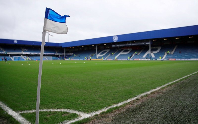
Queens Park Rangers fans have been reacting to footage of their new away kit that has dropped on social media.
QPR are a simple club when it comes to kits, or at least their home one which has been blue and white hoops since the 1960s. So when it comes to the away kit, things are allowed to get a little bit more experimental, and they certainly have had some striking designs in the past.
This year, for their away shirt, they haven’t gone as crazy as some of their other designs, instead going for a rather simple black and navy number with gold writing. They saved the creativity for the announcement video that came with it, which looked as if it was inspired by an action film.
But the fans weren’t paying attention to the film, rather what it was about, and there were plenty of them who were in love with the design when they saw it:
“Screams promotion before the clocks go forward”
Will QPR earn promotion next season?
Yes!

No!
It’s just a shame the league isn’t decided by who has the best kit, let’s see if the team can play just as well as the kit looks this season.
In other news: ‘Exactly the kind of player we need’, ‘Take him’ – Many SUFC fans react as rumour emerges